Elevating Your Etsy Presence: Branding Through Product Listings
Your product listings are the frontline soldiers in your battle for buyer attention.
Welcome to boot camp.
Of course, the first mission of your products listings is to sell your product. But if you want the person who you sold that product to to come back and buy more, you need them to leave with the knowledge of who you are, what kind of products you make and how your other products complement the one in the single listing.
This is where your brand comes in as the reinforcements for your first wave of attack. Here are our best thoughts on how to turn your product listings themselves into branding elements that people will remember you for.
CRAFTING A UNIQUE PHOTO STYLE FOR YOUR BRAND
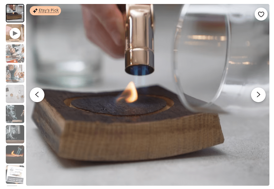
“Every picture tells a story,” “A picture is worth 1,000 words,” “Show me, don’t tell me”…how many cliches and bumper sticker wisdom do you need to understand the importance of a single image?
Your product photography is like a mini-ad unto itself. Gone are the days when you could snap a pic of your product sitting on a table or windowsill with your phone and consider the job done.
Yes, it’s a lot easier with today’s resources, but you still need to cultivate the mindset of the product photo as your visual signature, and not just showing what’s in stock.
- Developing a Thematic Background: Pick a theme that resonates with your brand. Selling handmade jewelry? How about a rustic wood background for that earthy feel? Vintage collectibles? Maybe a backdrop that screams retro. The key is consistency. Let your customers know it’s you just by the background.
- Foreground Elements: These are your secret sauce. A vintage book for that antique locket, a sprig of lavender with handmade soap. But remember, your product is the star. Everything else is just the supporting cast.
- Consistency in Composition: Train your customers to recognize your style. Always shoot from the same angle? Have a signature prop? Good. Create a pattern and stick to it. Before long, your customers will spot your listings in a sea of others.
STANDING APART FROM THE CROWD
If the above tips seem daunting, perhaps it might be easier to point out what to avoid when you’re developing your product photos. Driving school teaches good driving habits as much by showing how to avoid accidents as much as instructing compliance with the rules of the road.
Again, limits spawn creativity. Start building your sandbox with the below tips, then you can build the sandcastle of your dreams within it.
- Overused Styles: We’ve all seen them – the white-background, no-personality shots. They’re the vanilla ice cream of product photos. Safe, but forgettable. Don’t be that. Be the mint chocolate chip with extra sprinkles.
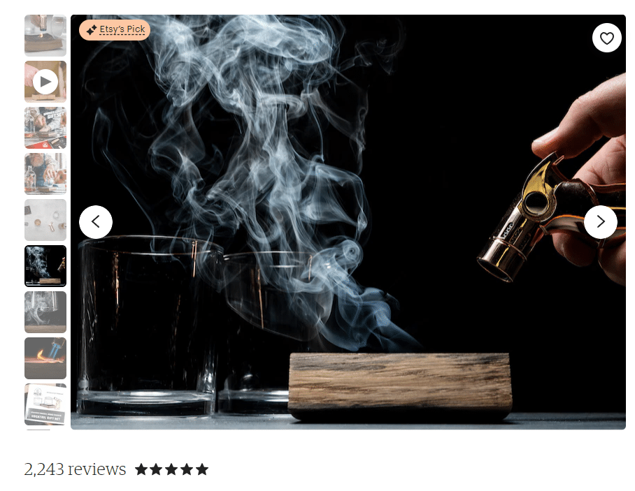
- Creating Distinct Photos: Play with shadows, textures, angles. Selling knitted scarves? Show them wrapped snugly around someone’s neck on a foggy morning. Selling pottery? Let’s see those mugs filled with steaming coffee. Evoke feelings, tell stories.
INTEGRATING BRAND GRAPHICS IN PRODUCT PHOTOS
Although there is certainly a longer story behind the creation of the “brand,” it should be remembered that brands were applied to cattle specifically so they can be identified if they wandered off the farm. In the ranch wars of the American West, brands unmistakably identified whose herd belonged to whom.
Your photos can also “wander off,” but for you it’s not a bad thing. Your photos could land in an Etsy ad, a spotlight or promotion or even if a shopper takes a screenshot and sends it to someone to gauge their interest. Brand your photos and you dramatically decrease the likelihood of potential future customers not knowing where to find the product.
- Subtle Brand Graphics: Think of your logo as a delicate watermark. It’s there, but it doesn’t scream for attention. And color schemes? They should complement, not dominate. Your graphics are the ribbon on the package, not the package itself.
- Maintaining Identity: Your product photos are your brand ambassadors on and off Etsy. Whether it’s on a Pinterest board or in an Etsy ad, they should be unmistakably yours.
TECHNICAL SPECIFICATIONS FOR PHOTOS
Even art needs a little science once in a while, and the science here is strictly file format. What are the right dimensions to prevent image distortion? What is the ideal PPI so it is a light enough file to download but still be sharp?
- Ideal Dimensions and PPI: Etsy loves 2000×2000 pixels, and so should you. It’s the sweet spot for detail and clarity. And stick to 72 PPI for web images – it’s the industry standard.
- File Types and Quality: JPEGs are your best bet. They’re like the universal blood type – compatible with almost everything. But keep an eye on the file size. Etsy’s limit is 20MB, but smaller files mean quicker load times and happier customers.
THE PERFECT LEAD PHOTO
Your lead photo is your first date with your customer. Make a good first impression (but be true to your authentic self).
- Impactful Lead Photo: This is your showstopper, your head-turner. It should be the epitome of your product – clear, attractive, and inviting. Think of it as your storefront window.
- Attractiveness vs. Representativeness: A delicate balance, indeed. Your lead photo should be both a beauty and a truth-teller. Misleading photos are the express lane to bad reviews and unhappy customers.
INCORPORATING VIDEO INTO YOUR LISTINGS
Videos is the new black.
Yes, we’ve focused mostly on product photos, which is still the meat and potatoes of product listings. However, data shows that people are exponentially more likely to buy something if they see it incorporated into a video.
So, lights, camera, SELL!
- The Power of Video: A 20-second clip can show your product in action, tell its story, and connect with your customer in ways photos just can’t. A scarf blowing in the wind, pages of a book turning – these are the things that bring your products to life.
- Creating Engaging Videos: Keep it short, keep it relevant, and keep it authentic. Show your product being used, loved, and enjoyed. And technical specs? Etsy recommends a resolution of at least 1080p and a file size under 100MB.
https://help.etsy.com/hc/en-us/articles/360053206073-How-to-Add-a-Listing-Video?segment=selling
LOOK FOR BEST PRACTICES
As always, we say there is nothing wrong with imitation so long as it is not outright theft or copyright infringement (looking forward to seeing all your Steamboat Willie merch).
Notice how the best listings are more than just sales pitches; they’re experiences. Pay attention to their photo styles, their use of graphics, their video content. What makes them pop? How do they tell their brand story? Take notes, get inspired, get creative.
Remember, your listings are more than just a means to an end; they’re the building blocks of your brand story. Experiment, innovate, and watch your brand come to life.
If you learned nothing new from the above, that’s great! Show us how you applied the knowledge, or even improved on it! Or maybe you’re still trying to figure out which end of the camera to use? Let’s turn this from a lecture into a discussion.
