Cart abandonment on Etsy is one of those things that can feel personal even when it isn’t.
You see the notifications. You see the favorites. You see the traffic. Sometimes you even see “in carts” on an item and think, Okay, we’re cooking.
And then… nothing.
No sale. No cha-ching. Just the quiet sound of a buyer walking away mid-decision.
Here’s the truth that will save your nervous system: most Etsy cart abandonment isn’t about your product being bad. It’s about the buyer getting stuck in a moment of uncertainty.
They were interested enough to add it. They almost bought. But something made them hesitate—usually something small, practical, and fixable.
That “something” is often clarity.
Not “more information.” Not “more words.” Clarity is different. Clarity is when the buyer’s brain can relax and say:
“I know exactly what this is, what I’m getting, and how it will work in my life.”
When that certainty is missing, buyers do what humans do: they postpone the decision.
And on the internet, “postpone” usually means “gone.”
The hidden psychology of Etsy carts: buyers are imagining regret
A cart is not a commitment. It’s a parking lot.
Buyers add items to cart because they like them, but they also add them because they’re still deciding. In that moment, they’re running a quiet internal risk assessment:
- “Will this look like the photos?”
- “Is this the right size?”
- “Is this a download or physical?”
- “If it’s a gift, will it feel impressive?”
- “Am I about to create a hassle for myself?”
If the listing doesn’t answer those questions, the buyer starts imagining regret—and regret is a strong motivator to close the tab.
So the fix isn’t “sell harder.” It’s “remove the regret scenarios.”
The real reasons buyers abandon cart (in real life terms)
1) They’re not sure what they’re actually buying
This happens constantly with digital products. A buyer likes your “wedding welcome sign” listing… but suddenly they wonder:
- Is this printed and shipped?
- Or am I downloading a file and printing it myself?
- Is it editable?
- What size is it?
- Do I need special software?
If the buyer has to guess, they hesitate.
Clarity fix: put the answer where they can’t miss it—first image and first lines of the description. “Digital download” should not be a surprise discovered after purchase.


2) The mockups look beautiful, but they don’t feel believable
Sometimes buyers abandon cart because the mockup looks almost too perfect. They worry the real product won’t match the fantasy.
This comes up a lot with:
- printable wall art sets (will it actually look like that on my wall?)
- POD apparel (will the print be that crisp?)
- drinkware (will the colors look that bright?)
Clarity fix: add one “real life” image or detail shot that makes the product feel true. Believability converts.
3) The buyer can’t picture it in their life
This is the “floating PDF” problem and the “single mockup on white” problem.
A buyer might love your bathroom humor print set, but if you never show it framed on a bathroom wall, they’re doing extra imagination work. Most buyers won’t do that work.
Same with a graduation party bundle: the buyer wants to see it as a cohesive “event ecosystem,” not as a pile of files.
Clarity fix: show context. Show the scene.
4) They hit a friction moment: price, shipping, timeline, or effort
For physical products, cart abandonment often happens at checkout when shipping costs appear or delivery dates feel too slow for the buyer’s urgency.
For digital products, friction can be different: the buyer realizes they’ll have to print, cut, assemble, or learn a tool.
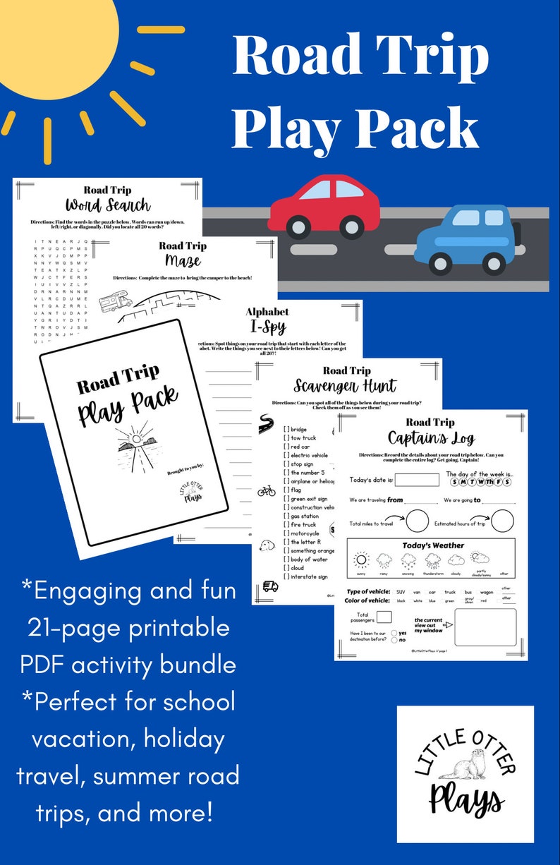
Example: a kids road trip activity pack might be adorable, but if the buyer suddenly thinks, “Do I have time to print 25 pages tonight?” they back out.
Clarity fix: reduce perceived effort:
- “Print only the pages you want.”
- “Includes a low-ink option.”
- “Print-at-home friendly.”
- “Quick-start version included.”
You’re not changing the product—you’re changing how doable it feels.
5) The shop feels scattered, so the buyer doesn’t trust consistency
This one is subtle but real. Buyers often click your shop name, scroll a bit, and decide whether you feel “legit.”
If your shop looks like five unrelated aesthetics fighting each other—retro diner prints, boho nursery quotes, goth wedding invites, random shirts—the buyer may like the item but still think:
- “Is this seller consistent?”
- “Will the quality be what I expect?”
Clarity fix: coherence. Collections. Naming. A clear lane.
6) The buyer wants a more complete option
This is a big one, especially with wall art and events.
A buyer adds a single print to cart… then realizes:
- “Actually, I need a set of three.”
Or: - “I need the full party pack, not one game.”
If you don’t offer the “complete version,” they leave to find someone who does.
Clarity fix: offer a value ladder:
- single item
- set
- full kit
And make it obvious in the listing.

A few niche examples where clarity makes the sale
Wedding signage suites
Cart abandonment often comes from confusion: editable vs not, size options, what’s included.
A seller who shows:
- a “what you get” card
- sizes and formats
- and a simple “how it works” line
will convert better than a seller with prettier mockups but less clarity.
Classroom packs
Teachers are high-intent buyers, but they abandon cart if they can’t tell:
- how many pages
- what’s editable
- how it prints
- how it fits into their classroom routine
Teachers don’t want more choices. They want certainty.
Bathroom/laundry decor sets
These buyers want the wall to look styled. If you sell one print and don’t show “set of 3” options, they often bounce to a seller who does.
The “Clarity Stack”: what to fix first (without rewriting your life)
If you want the highest-impact improvements, focus on these in order:
- Make “digital download vs physical” obvious immediately
- Add a simple “what you get” image/card
- Show the product in a believable real-life context
- Use consistent naming and collection language
- Offer a complete option (set/kit) when the niche expects it
You don’t need more hype. You need fewer buyer questions.
Final thought
Cart abandonment isn’t rejection. It’s hesitation.
And hesitation is often a clarity problem, not a creativity problem.
When your listing removes uncertainty—what it is, what they get, how it works, how it looks in real life—buyers stop using the cart as a parking lot and start using it as a checkout path.
That’s the real Etsy conversion upgrade: making buying feel safe.
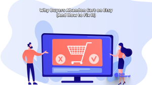
- Why Buyers Abandon Cart on Etsy (And How to Fix It)
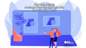
- The Photo Story: Mockups That Feel Like Real Life (Not Floating PDFs)
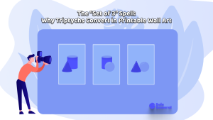
- The “Set of 3” Spell: Why Triptychs Convert in Printable Wall Art
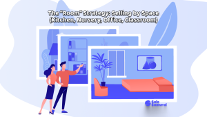
- The “Room” Strategy: Selling by Space (Kitchen, Nursery, Office, Classroom)
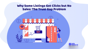
- Why Some Listings Get Clicks but No Sales: The Trust Gap Problem