As a way to celebrate the best of Etsy, the platform has organized a global awards program honoring the work of sellers – The Etsy Design Awards. This year’s winners have already been announced, giving sellers a lot of food for thought.
But what makes the winning Etsy shops stand out? Are there any recurring patterns and best practices we can extract from the winners? Can we offer some tips for other sellers?
The answer to all of these questions is a simple yes. Here are the details.
The Etsy 2022 Design Award winners

Before we begin with our analysis, we’d like to congratulate the following winners in their categories:
- WeAreLunarium – Grand Prize Winner
- SurreyWoodsmiths – People’s Pick Winner
- Pedro Mealha – Home Decor & Lighting Winner
- SIND STUDIO – Kitchen & Dining Winner
- Bertu Home – Furniture Winner
- Muc Design – Vintage Winner
- Art by Dina D – Art Winner
- It’s All Culture Jewelry – Jewelry Winner
- B.THAMM – Clothing & Accessories Winner
- Fern & Moon – Weddings & Celebrations Winner
- Colette Bream – Kids Winner
- Live In Ideals – Pets Winner
As you can see, each of these shops has outperformed its competitors in a specific niche. At a glance, you may think that it’s difficult to compare them or extract any valuable best practices because of the difference in categories. In reality, this is a far cry from the truth.
There are certain Etsy approaches that can make any shop stand out regardless of the niche. We’ll reveal these for you in the next sections by examining specific shops and listings.
Practices that make the winners stand out from the rest
We used Sale Samurai to perform detailed research into all of the Etsy shop winners announced at the awards. Here are our discoveries.
Product Diversity
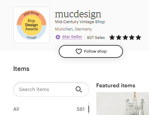
The first thing that became evident throughout our research is the rich product diversity found in the majority of the shops. For instance, the Muc Design shop has almost 600 active listings. Most of the winners have at least 100 listings, with some minor exceptions. Out of all of the mentioned shops, Live In Ideals is the one with the lowest product diversity. The shop consists of only 14 listings. However, their “Rectangular cat house, Large cat house, Modern cat bed, Modern cat furniture, Handmade cat furniture” has made it to the top of the awards list in the pet category due to its natural materials, sleek design, and creative concept.
But why is product diversity so important?
It enables a single seller to reach a wider audience. By offering different products, you become more attractive to buyers with different tastes, needs, and expectations to show. In addition, product diversity allows you to target buyer groups with different budgets. We noticed that most of the award winners have listings at different price points. Some products are affordable, while others are pricier.
Pricing strategies
We’ve always said that pricing is key to success on Etsy. And this is clearly evident throughout our exploration of the award winners.
We discovered that all shops had listings with varying prices.
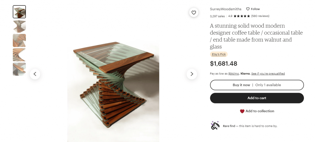
Let’s take a look at Surrey Woodsmiths for example. Their most expensive listing is the “A stunning solid wood modern designer coffee table / occasional table / end table made from walnut and glass”, which sells for $1,681.48. Regardless of the expensive price, the product has been sold more than 3,200 times.
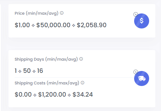
Why? Because this price is reasonable for the niche. Using Sale Samurai, we did a quick search on some of the main keywords used by the seller. For instance, we saw that the average price for listings ranking for “walnut table” is $2,058.90, while the highest price is $50,000. Surrey Woodsmiths’ listing is lower than the average but that’s only because the seller can afford to do so. The listing was created on October 19, 2015, meaning that the product is mature. It has spent enough time on Etsy to attract nearly 900 likes and a lot of attention from users.
Because of this, the seller can set a higher price and still enjoy sales.
However, the same shop also sells products priced at much lower prices. Let’s take the “Decorative wooden wall clock, large clock or small clock, Statement clocks for living room, bedroom, hallway or office, wood clock”, which costs $190.86. The product has generated more than 3,000 sales. Although it’s in the same shop, it targets a buyer group with a lower budget, but with an interest in statement furniture and decor made from wooden materials. Again, the pricing has been selected based on niche standards.
Listing optimization
Next, we dug into listing optimization. The conclusions are similar to our expectations.
Four elements stand out:
- Use of tags
- Titles
- Descriptions
- Images
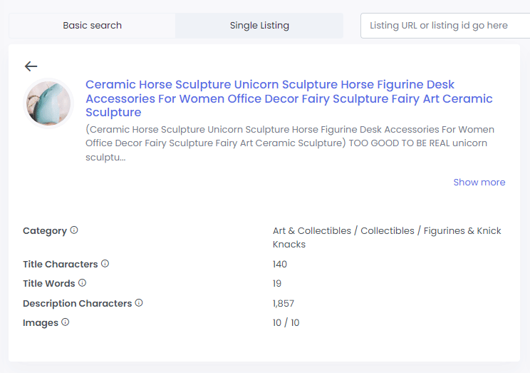
To present our findings, we’ll take SIND STUDIO’s “Ceramic Horse Sculpture Unicorn Sculpture Horse Figurine Desk Accessories For Women Office Decor Fairy Sculpture Fairy Art Ceramic Sculpture” listing. It sells for $106.20, and has scored more than 8,000 sales. So why is it so successful?
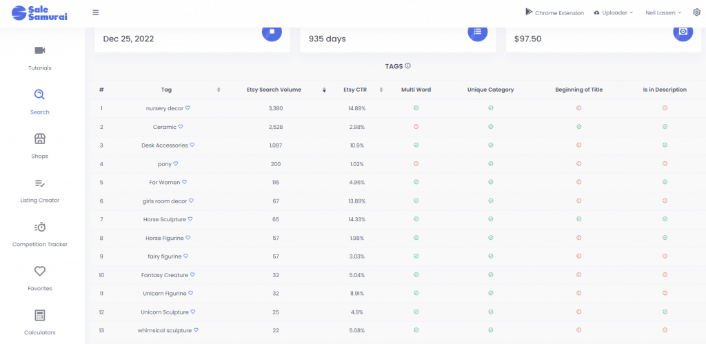
Sale Samurai showed us that the listing uses the full 13 tags made available by Etsy. This allows the product to appear in a range of user searches on the platform. In addition, the seller has carefully selected popular keywords that buyers are actively looking for. For example, some of the tags used include “nursery decor” with a search volume of 3,380 and “ceramic” with a search volume of 2,528. This helps the listing become visible and easily discoverable on Etsy for users searching for similar products.
Furthermore, the seller takes advantage of the full 10 images per listing permitted by Etsy. This is also essential for visibility as it makes the listing more optimized and likely to appear higher up in search results.

Additionally, the title is easy to read and contains 140 title characters and 19 title words. The primary keyword “ceramic” is placed at the very beginning and abides by Etsy’s recommendations. The product description is further enriched with tags and contains
1,857 characters, which successfully outline the product’s specifications, characteristics, and unique selling points.
This scenario is very similar to the rest of the shop winners we researched.
Imagery
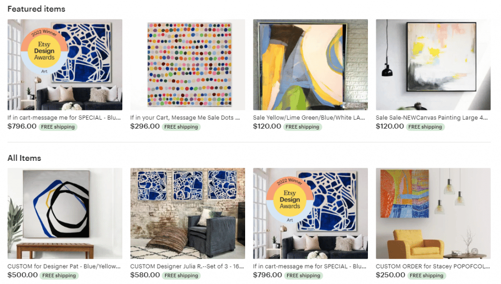
Imagery is one of the key selling points on Etsy. It can help you build a distinctive brand. Regarding best practices, all of the award winners share a few common approaches.
For starters, we noticed that most listing images come with a clean background, usually in white or grey colors. This helps the product stand out and creates a visually appealing contrast. Next, each listing is equipped with as many images as possible (usually 10), which present the product from different angles. This helps the potential buyer get a full picture and creates realistic expectations. The photos are vividly professional, with attention to every detail.
Considering that Etsy is a marketplace for authentic goods and creative products, it’s no surprise that images are key. The winners have all successfully attracted attention with perfect choices of imagery.
Reviews
If you’ve browsed through different Etsy shops in search of inspiration as a seller, you’ve probably noticed the difference in reviews. Shops with higher ratings and more reviews usually perform better. This is because Etsy’s algorithm perceives them as more reliable and relevant for users. As a result, they’re presented higher up in search results.
Remember that most buyers will only skim through the first few pages of results. If you’ve made it there, the chances of sales are higher.

When looking at the award winners, we detected that all of the shops have an average review rating of 4.8 or higher. Some even have a full 5-star rating. This means that the sellers have put in extra effort to provide an exceptional service that deserves to be positively reviewed. It could also indicate that somewhere along the buyer lifecycle, the seller has encouraged the user to leave a review and rate their Etsy store. This is incredibly important if you want to quickly grow your presence and increase your sales.
The key takeaways
If you want to see your shop evolve, grow, and attract more buyers, it’s worth considering all of the outlined findings.
Below, we’ve summed up the important takeaways and best practices that you should incorporate into your own Etsy shop:
- Include diverse products and prices in your Etsy shop
- Set your prices according to niche trends
- Include the maximum of 13 tags in your listing
- Add the full 10 images allowed by Etsy
- Make your titles and descriptions easy to read
- Rely on professional images
- Encourage buyers to rate your shop
For each point, we’ve looked at an example from the Etsy 2022 Design Awards winners. We’ve also provided arguments showing why these suggestions are beneficial for your SEO performance on Etsy.
Wrapping up
Learning from the best is one of the quickest ways to achieve your goals and boost your performance. The Etsy 2022 Design Awards have enabled us to peek into a number of exceptional shops.
With access to Sale Samurai, we were able to dissect their strategies and discover paths to success without wasting any time. Use these insights to your advantage and season your Etsy shop to match some of the most outstanding ones on the platform.


