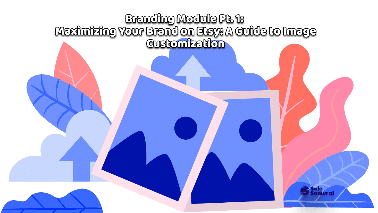
Maximizing Your Brand on Etsy: A Guide to Image Customization
Savvy and experienced Etsy shopkeepers are, by now, pretty adept at knowing what they need to do to attract customers. They’ve learned by trial and error, they’ve followed all the individual blogs we’ve written on the topic, perhaps they’ve even gone out of the dependable Sale Samurai knowledge base and discovered some tips on their own.
That said, for their sake as well as for those who may not be well versed, consider this either a primer or a refresher course on what it takes to properly brand your Etsy store.
Today we’re going to focus on the visuals of your store, as that is the first thing people will see, whether they found you via search or if your brilliant marketing (see you in a couple of weeks for that one) brought them there.
UNDERSTANDING AND OPTIMIZING ETSY’S CUSTOMIZABLE IMAGE ELEMENTS
So, what are the available branding “assets” that you need to build for your storefront?
In the world of brick and mortar, those questions would include: what kind of signage are you going to use, painted, static, neon? Will you have an awning, and if so, what’s the size your permit allows? Are you allowed to put a sandwich board on the sidewalk?
Etsy stores have their own constraints. But, just as a brick-and-mortar shopkeeper needs to think of the above examples as tools to attract and retain customers, the below represents the allowable real estate that the county fathers at Etsy give you a digital permit to work with. We also include tips on how to maximize the usage of these spaces.
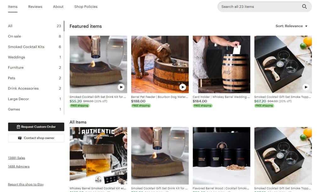
- Shop Icon (500×500 pixels): Think of this as your shop’s calling card. It’s small but speaks volumes. Go for a high-resolution image that captures the essence of your brand. Maybe it’s a logo, maybe it’s a snapshot of your bestseller, or maybe it’s your face (if you’re brave enough). Whatever it is, make it pop.
- Shop Banner (Standard: 1200×300 pixels, Mini: 1600×400 pixels): This is where you get to flex your creative muscles. It’s the first thing visitors see, so make it count. Whether you’re going for the standard or mini size, ensure it’s a high-quality image that represents your brand’s vibe. No blurry, amateur hour stuff here. Think of it as the billboard that makes passersby go, “Damn, I need to check this out!”
- Listing Photos (2000×2000 pixels): Here’s where the magic happens. Each photo is a window into your world. High resolution? Check. Multiple angles? Check. A clear representation of what the heck you’re selling? Double-check. Remember, online shoppers can’t touch or feel your products, so your photos need to do the heavy lifting.
- About Section Photos (2000×2000 pixels): This is the ‘Behind the Scenes’ section – your chance to show off your process, your workspace, your cat sleeping in the corner (because who doesn’t love a good cat pic?). It humanizes your brand and connects you with buyers on a personal level.
- Custom Order Image (2000×2000 pixels, if applicable): Offering custom orders? Showcase what makes your custom work special. Tease them with the endless possibilities of what they can have.
Pro tip: Image quality and load times go hand-in-hand. Don’t let your visuals be the reason a customer bounces off your page. Optimize, optimize, optimize!
ETSY STORE PAGE BRANDING DO’S AND DON’TS
As I’ve said in other blogs, limitations force creativity. The above-described assets are limitations, yes, but if you’re a creative type (which is about 99.9% of Etsy shopkeepers), you will find a way to think outside the box while still well within it:
- Cohesive Visual Theme: Let’s not turn your store into a visual circus. Stick to a theme. Whether it’s a color scheme, a style, or a vibe, consistency is your best friend.
- High-Quality Images: This is non-negotiable. If your images look like they were taken with a potato, we’ve got a problem. Invest in a good camera or a good photographer – it’s worth it.
- Brand Colors and Logos: Your brand colors and logo are like your signature. Use them wisely and consistently across your store to create a strong, recognizable brand identity.
- Variety in Listing Photos: Show your products from every angle, in every use case, in all their glory. Help your customers visualize what it’s like to own them.
- Your Brand Story in the About Section: This is where you get to tell your story – who you are, why you do what you do, and what makes your products special. Be authentic, be compelling, be you.
And of course, there are the things that still need to be considered within said box:
- Cluttered Designs: A cluttered store is a turn-off. Keep it clean, keep it organized, keep it focused.
- Low-Resolution Images: We live in a high-def world, my friends. Blurry, pixelated images are a big no. They scream unprofessionalism and lack of attention to detail.
- Text Overload on Banners: Your banner is not a novel. Keep text minimal. Let the visuals speak for themselves.
- Inconsistent Style: Your store should not look like a patchwork quilt of random styles. Keep it consistent. Keep it branded.
BEST PRACTICES AND SOME CREATIVE IDEAS
“Best practices” is exactly what it means. What are the best ways to do this and who is doing it? If you’re mental canvas is blank, throw some colors on it by browsing Etsy and looking at others working within your niche. What are they doing that makes them stand out? How are they using their image spaces? Learn, adapt, and apply.
- Creative Banner and Icon Use: Don’t be afraid to step out of the box. Your banner and icon are prime real estate for making a first impression. Make it bold, make it unique, make it unforgettable.
- Aligning Etsy Branding with Your Online Presence: Consistency across your online presence – from your Etsy store to your website to your social media – is key. It strengthens your brand and builds trust with your audience.
TOOLS AND RESOURCES FOR IMAGE CREATION AND OPTIMIZATION
Not a graphic designer? You’re not alone. That said, there’s a plethora of resources, tutorials, and templates out there to help you whip up professional-looking images in no time. And, for those who have been daunted by traditional digital design tools such as the Adobe suite, there is a little miracle called Canva, which allows non-design types to design.
Unlike myself, my wife was not trained as a graphic designer, but because of the continual need for graphics in any kind of communication, she became adept at Canva and is now developing newsletters and other collateral for her 100% non-creative job. We now compete to see who solves a visual problem better with our respective tools. No lie, she gives me a run for my money. So don’t get stuck in the “I can’t design” mindset. As I’ve said for years, if one human can do something, any human can do it.
Remember, your store’s visuals are more than just pretty pictures; they’re your silent salespeople. Make them work for you.
Got an Etsy store that’s a visual masterpiece? Or maybe you’re still trying to figure out which end is up? Either way, I want to hear about it. Take advantage of this community.
- Why Buyers Abandon Cart on Etsy (And How to Fix It)
- The Photo Story: Mockups That Feel Like Real Life (Not Floating PDFs)
- The “Set of 3” Spell: Why Triptychs Convert in Printable Wall Art
- The “Room” Strategy: Selling by Space (Kitchen, Nursery, Office, Classroom)
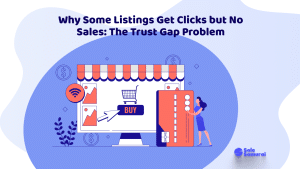
- Why Some Listings Get Clicks but No Sales: The Trust Gap Problem