
If you’ve ever sold (or bought) printable wall art on Etsy, you’ve probably noticed something a little unfair:
A single print can be gorgeous… but a set of three often sells faster.
Not because buyers suddenly became art collectors. Because a “set of 3” solves a problem the buyer may not even realize they have until they see the solution:
“I want my wall to look finished, but I don’t trust myself to style it.”
That’s the set-of-3 spell.
Triptychs convert because they remove decision fatigue, create instant visual confidence, and make the buyer feel like they just bought taste.
And on Etsy—where people are shopping for vibe and identity as much as function—“I bought taste” is one of the strongest reasons someone clicks Add to Cart.
Let’s break down why the triptych works, how to build sets that don’t feel generic, and how to present them so the value is obvious.
Why sets of three feel “right” in the human brain
Three is a magic number in storytelling, and it’s also a magic number in design.
A single print can feel lonely. A pair can feel like a comparison. A set of three feels like a composition. It gives the wall a rhythm:
- left
- center
- right
That rhythm creates the impression of intentional design, even if the buyer isn’t an interior decorator.
It’s the same reason people like:
- three candles on a table
- three framed photos on a shelf
- three stacked books with a plant on top
Three reads as styled.

The real reason triptychs convert: they reduce the buyer’s fear
Etsy buyers love wall art, but many are nervous about it. They worry:
- “Will this look weird in my space?”
- “Do these colors match my room?”
- “Will one print look too small?”
- “How do people make walls look like Pinterest?”
A set of three quietly answers those fears:
- It looks intentional by default
- It fills space more naturally
- It gives a “mini gallery wall” effect without needing expertise
- It makes the buyer feel safe
Triptychs are basically “decor training wheels,” and buyers love them for it.
What makes a set-of-3 actually good (not just three random prints)
This is where sellers get tripped up. A triptych is not three prints that happen to share a theme. A triptych is three prints that feel like they belong in a single breath.
A strong set usually has one of these structures:
1) The Center Anchor
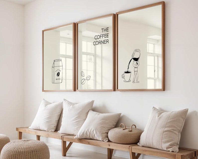
- The middle print is the star
- The left and right prints support it
This is perfect for:
- kitchen sets (“Fresh Coffee” in the center, supporting icons on sides)
- nursery sets (name print in center, animals on sides)
- motivational office sets (core phrase in center, supporting lines on sides)
2) The Progressive Story
- Print 1 introduces
- Print 2 deepens
- Print 3 resolves
This works great for:
- seasonal sets
- holiday sets
- travel sets
- funny quote sequences that build
3) The Visual Trio (pattern + cohesion)
- Three prints share a motif (shapes, icons, botanicals, moons, etc.)
- Each print is distinct but unmistakably related
This is the “gallery wall starter kit” vibe.
4) The Palette Set
- The main job is color harmony
- The subject can vary, but palette ties everything together
This is big in:
- minimalist spaces
- boho neutral spaces
- mid-century modern decor lanes
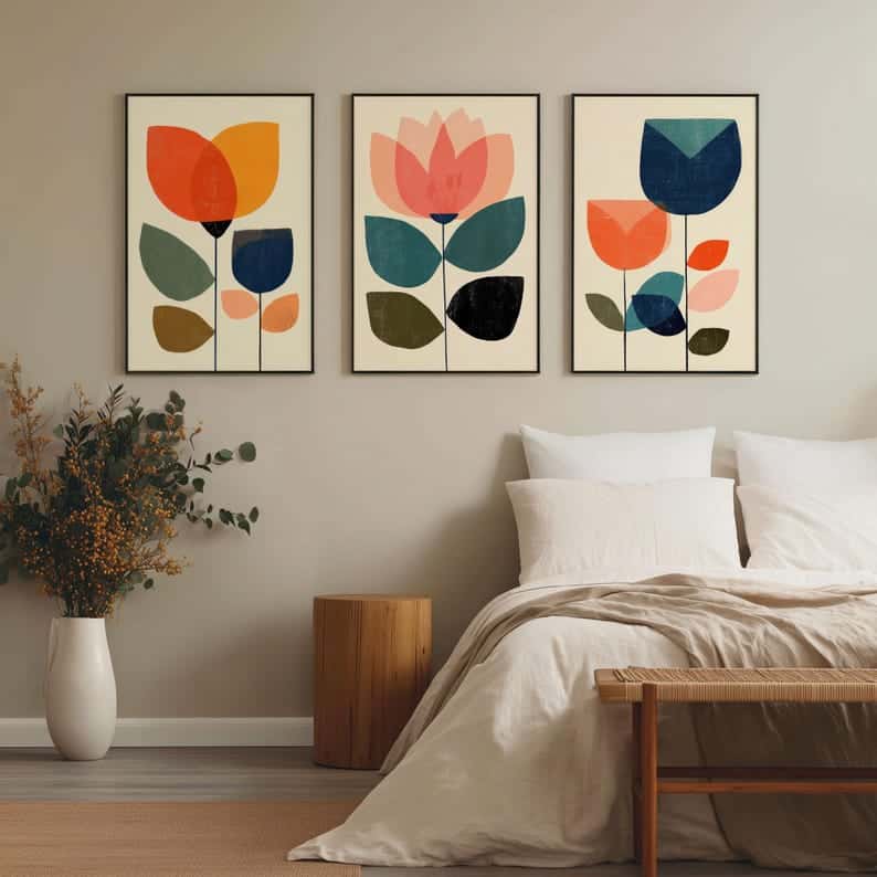

The best niches for triptychs (and why they keep selling)
Triptychs work anywhere, but they’re especially strong in rooms that buyers actively “style”:
- Kitchen (coffee bar, pantry, retro diner, farmhouse)
- Nursery (animals, name sets, gentle educational prints)
- Bathroom/Laundry (funny functional decor)
- Home Office (calm focus, minimalist motivation)
- Entryway (welcome sets, house rules, family name sets)
These are the rooms where people want quick, visible “upgrade” results.
How to price and position a set without sounding salesy
The biggest mistake is selling it like “three items.”
Sell it like:
- a finished look
- a styled wall solution
- an instant mini gallery wall
A buyer isn’t paying for extra pages. They’re paying for less effort.
A nice way to frame it in the first paragraph:
- “A coordinated set of three prints designed to hang together—so your wall looks styled instantly.”
And then make the value obvious with a clean preview image that shows:
- all three prints side by side
- how they look in frames
- at least one room mockup (kitchen/nursery/office)
Presentation: the “3 images you must include” to convert triptychs
You can have the best set in the world and still lose sales if the buyer can’t picture it.
Make sure you include:
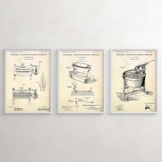
- A side-by-side preview of all three prints (clean and readable)
- A framed mockup showing them hung together on a wall
- A “what you receive” graphic with sizes, file formats, and variations
That last one kills the trust gap fast.
People love triptychs… as long as they’re sure what they’re buying.
Where Sale Samurai fits
Triptychs are search-driven. Buyers don’t just search “wall art.” They search:
- “set of 3 wall prints”
- “gallery wall set”
- “kitchen wall art set of 3”
- “nursery prints set”
- “boho wall art set”
Sale Samurai helps you verify:
- which phrases are most common (“set of 3” vs “set of three”)
- which room + aesthetic combinations have demand
- which sets feel crowded vs under-served
It’s the difference between guessing “boho kitchen set” and knowing buyers actually type “boho kitchen wall art set of 3.”
Final thought
The set-of-3 spell works because it gives buyers what they really want:
A wall that looks intentional without them having to become a decorator.
When you build triptychs with a clear structure, cohesive palette, and obvious presentation, you’re not selling three prints.
You’re selling a finished scene.
And scenes convert.